How to Get the Most from Checkmark Color Icons Without the Common Pitfalls
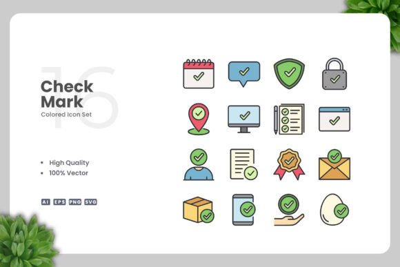
Icons are one of those design elements that seem simple until you try to use them in a real project. A checkmark, in particular, carries a lot of weight. It signals approval, completion, success, and yes. When you're working with Checkmark Color Icons, the goal is to make that signal clean, professional, and adaptable. But many people end up with icons that look pixelated, clash with their brand, or take longer to edit than the actual design work. That's what we're going to fix here.
Whether you're building a website, designing a mobile app, creating a social media graphic, or putting together a flyer or poster, the way you handle these icons matters more than you might think. Let's walk through the common mistakes and, more importantly, how to avoid them.
Mistake #1: Treating a Vector Icon Like a Raster Image
One of the most frequent missteps happens right at the start. People download a set like Checkmark Color Icons and immediately drop the PNG into their design software, thinking that's the only option. Then they try to resize it, and the edges get fuzzy. Or they try to change the color, and they can't because there's no path to edit.
The whole point of a vector-based icon set is that it's built with mathematical paths, not pixels. The files included in this set — the AI source file, the EPS Version 10, and the SVG file — are what give you real flexibility. If you're opening the PNG transparency file and wondering why you can't change the checkmark from green to blue, that's your answer. You need to open the vector file in software like Adobe Illustrator or CorelDRAW.
Once you do, you can resize the icon to fit a billboard or a favicon without losing quality. You can also adjust the stroke weight, tweak the curvature, or change the color in seconds. That's the difference between an icon that works and an icon that fights you.
Mistake #2: Ignoring the Color Context of Your Project
Color is where most design breakdowns happen. A bright green checkmark might look perfect on a white app screen, but put it on a yellow button or a busy infographic background, and suddenly it's hard to read. The Checkmark Color Icons set is designed to be customizable, which means you have control over every hue. But that only helps if you actually take the time to match the icon to your color palette.
A common oversight is using the default colors from the icon set without testing them against your brand guidelines or your specific layout. This can make a polished design feel off-the-shelf and mismatched. Instead, open the vector file and sample the exact colors from your brand style guide. Adjust the checkmark to sit comfortably within your visual hierarchy. If your project uses a lot of warm tones, a cool-toned checkmark might stand out in the wrong way. Small adjustments here make a big difference in perceived quality.
Mistake #3: Overcomplicating the Icon When Simple Works Better
There is a temptation to add effects, shadows, gradients, or outlines to a checkmark icon to make it feel more "designed." But a checkmark's strength is its simplicity. You want the viewer to recognize success or completion instantly, not to pause and interpret a complex graphic.
The clean design of Checkmark Color Icons is intentional. It follows the principle that an icon should communicate at a glance. When you start adding unnecessary embellishments, you risk slowing down comprehension. This is especially important in mobile apps and user interfaces where screen space is limited and users are scanning quickly.
Instead of adding more, focus on consistency. Use the same icon style across all your materials — web, print, social media, and presentations. That consistency builds trust and recognition. If you need to differentiate between states, use color or size variation, not visual clutter.
Mistake #4: Forgetting That Print and Screen Have Different Needs
This is a mistake that catches freelancers and small business owners particularly often. You design something for social media, it looks great on screen, and then you try to use that same file on a printed flyer or banner. The resolution is wrong, the colors shift, or the icon is too small to read at a distance.
The Checkmark Color Icons set works for both print and digital, but you need to prepare the file appropriately for each medium. For print, use the AI or EPS file and set your document to CMYK color mode if you're going to a commercial printer. For screen, use the SVG or PNG files in RGB. If you try to use a low-resolution PNG from a screen design in a large-format poster, you'll get a blurry mess.
Always check the output size and medium before you export. An icon that works at 24 pixels on a mobile app might need to be scaled up significantly for a banner. Because the source is vector, scaling is easy — but only if you start from the vector file, not a raster export.
Mistake #5: Not Checking the File Formats Before You Start
Another practical misstep is assuming all icon sets include every format you might need. With Checkmark Color Icons, the included files are clearly listed: AI source file, EPS Version 10, SVG, PNG with transparency, and a readme file. That covers almost any use case. But people sometimes open the AI file in an older version of software and get a compatibility warning, or they try to open the EPS file in a program that doesn't support vector editing.
Before you begin, make sure your software can handle the formats. Adobe Illustrator and CorelDRAW are the recommended tools for editing the vector files. If you're using free or open-source software, the SVG file is usually your best bet because it's widely supported. The PNG transparency file is ready to use if you need a quick drag-and-drop solution, but remember that PNG is raster and won't scale infinitely.
Reading the readme.txt file might feel like an extra step, but it often contains useful notes about font dependencies, color swatches, or layer organization. Skipping it can lead to confusion later.
Mistake #6: Using the Same Icon Size Across Different Applications Without Testing
A checkmark that looks balanced in a mobile app button might feel too heavy in a book layout or too light on a poster. Each application has its own visual context. What works in an infographic with lots of data points may not work on a social media card that relies on white space.
The flexibility of Checkmark Color Icons lets you resize and adjust each instance independently. Take advantage of that. When you're designing for multiple channels, create separate versions tuned to each format. On a flyer, the checkmark might need to be bolder and slightly larger to be seen from a few feet away. In a mobile app, it should be crisp and compact. In a presentation, it should align with the slide's visual rhythm.
Test your icon in context before finalizing. Place it next to text, on colored backgrounds, at different sizes, and on the actual device or print type you'll be using. That small step saves you from last-minute surprises.
What to Check Before You Buy or Download
Before you invest time in any icon set, verify that it gives you the control you need. Look for the following:
- Vector source files – AI or EPS so you can edit paths, colors, and sizes.
- Multiple formats – SVG for web, PNG for quick use, and a source file for deep customization.
- Clear licensing – Make sure you can use the icons in commercial projects, client work, or personal projects as needed.
- Consistent style – If you're buying a set, check that all the icons share the same visual language. That matters when you use them together.
- Ease of editing – The icons should open cleanly in standard vector software without missing fonts or broken paths.
The Checkmark Color Icons set meets these criteria. The design is high quality, fully vector, and customizable. The drag-and-drop simplicity works for beginners, while the source files give professionals full control.
Better Results Start with the Right Foundation
The difference between a project that looks professional and one that looks rushed often comes down to small details. Your icons are part of that. When you use a clean, adaptable set like Checkmark Color Icons and avoid the common mistakes we've covered, you save time, reduce frustration, and get better results across every medium — from websites and mobile apps to books, social media, infographics, flyers, print, banners, and posters.
Open the vector file, adjust the color, size it to your needs, and test it in context. That process takes only a few minutes and pays off in every project you apply it to. Thanks for reading, and have a great day. Upnowgraphic.